Why Gray is a Fantastic Backdrop for Almost any Accent Color
Interior Design trends come and go. Trends are driven by shapes, materials, colors and other elements. Of all elements, color trends have been very dominating. Do you remember the olive and gold look of the 60’s and the mauve and gray in the 70’s? The current infatuation with GRAY has dominated in a such a huge way that it has taken over architecture, fabrics, furnishings, lighting, materials and just about everything on the interior spaces. What is fascinating about the GRAY craze is the use of a multitude or “50+ shades of gray!” Designers are layering multiple shades of gray on top of each other creating so many beautiful visual and psychological effects.
The evolution of the gray trend is now focused on what accent color is going to be placed on top of the GRAY? Two years ago the accent color was gold, last year it was Turquoise. Now we are seeing dark purple and cobalt blue coming out in our supplier’s catalogues and markets we attend. Gray is a fantastic backdrop for all colors!
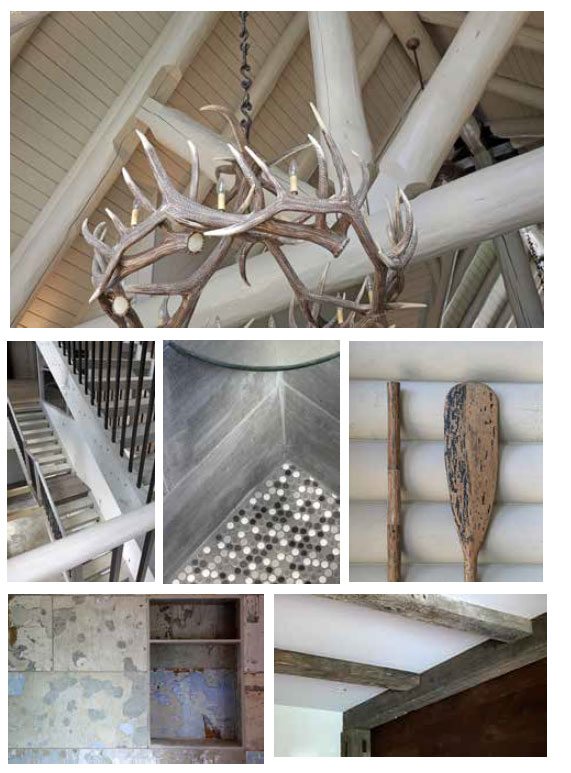
The emotional/subliminal and psychological impact of color has never been so dramatic than with the use of gray. The effect Gray has had on our clients has been astounding. The light warm grays have a calming, soothing spa like effect. One client was ready to sell their huge log home because they could not sit in the great room area. All surfaces in the room were aged white cedar with aged polyurethane applied – both which had yellowed with the sun and age. They stated: “it was dreary, depressing and dark.” We bathed the huge log structure with a warm, light gray paint. They are once again in love with their home! We have also used reclaimed gray barn wood to give a textural gray look. We have incorporated gray concrete and tiles to play on textures and patterns.
Worth noting is that not all grays are equal in terms of impact. Warm light grays are much more soothing and inviting than cool dark grays.
Gray is actually the absence of a color so it is important to blend other colors with the grays as accents to create a successful design. This last week, I toured several of our client’s homes with my photographer Tom Harper to document all the different ways we are using gray in our projects. Tom captured images of multiple shades of gray evident in a wide range of materials.

